


Two Are Better Than One: Ecclesiastes 4:9-10 in the King James Version
- Files
- 4 JPG and 1 PDF, 250+ DPI at the listed sizes
- Ratios
- 2:3, 3:4, 4:5, 11:14
- Designs
- 1 verse design
- License
- Personal use
Ecclesiastes 4:9-10 fills the center of this print in the King James wording, from "Two are better than one" to "the one will lift up his fellow." The verse is set in a plain book serif in deep black on warm cream, and the design closes with "Two are better." in a larger script, followed by the reference in spaced capitals. It is a calm typographic piece for a newlywed bedroom or a first anniversary gift.
What Ecclesiastes 4:9-10 says about two people
These two verses open the passage that ends with the cord of three strands in verse 12. Just before them, the writer describes someone who works alone, with no family to share it, and asks who all the effort is for. His answer is company. Two people get a better return for the same labor, and when one falls, the other is there to lift him up. The King James Version puts it as "a good reward for their labour" and keeps the older word "fellow" for the companion. Verse 10 goes on to warn about falling with no one near to help, and the print leaves that part out, ending instead on a short line of its own, "Two are better." Read at a wedding, the verses describe marriage as a working partnership, two people sharing the load and catching each other when one stumbles.
Serif lines, a script closing line and warm cream
The layout is centered and narrow. The verse runs over eight short lines of a classic book serif in deep black, with the breaks falling at natural pauses: "Two are better / than one; / because they have / a good reward / for their labour." Below the verse, "Two are better." is set larger in a flowing script, the only decorative element on the page. A short thin rule follows, then the reference Ecclesiastes 4:9-10 in widely spaced capitals. The background is a warm cream, close to off white, with wide margins on every side and no border. One listing photo shows the print in a light oak frame above a bed with a sage green cover, and a close view shows the script line on a soft paper texture.
For newlyweds, anniversaries and a first home
The photo above a bed shows the narrow text column at a large size over a headboard, and at 8x10 or 11x14 the print fits a hallway or a shelf. As a gift it suits a wedding or an engagement, a bridal shower, or a first anniversary, which is traditionally the paper anniversary, so a printed verse on good paper matches the custom. A couple moving into their first home is another fit, since the verse is about sharing the work of a life. For frames, the listing suggests oak, walnut, black, brass or matte white. The cream background and black type sit well in all of them, so the frame can follow the rest of the room. If you also own the Cord of Three Strands print, the same frame color on both ties them together.
Files, sizes and print quality
The download has four JPEG files, one in each ratio: 2:3, 3:4, 4:5 and 11:14. Together they cover frames from 4x6 to 24x36 inches, including 22x28 from the 11:14 file, and every listed size prints at 250 DPI or more, which stays sharp at normal viewing distance. A PDF that lists all the print sizes is included for ordering at a print shop. Black type on cream reproduces well on most printers, though the cream depends on your paper: a bright white sheet makes it look slightly cooler, and a natural white keeps it warm. Fine art matte paper suits the thin serif best. Pick the ratio that matches your frame before uploading, so the margins stay even on all sides.
Sizes and formats
| Ratio | Standard frame sizes it fits |
|---|---|
| 2:3 | 4x6, 6x9, 8x12, 12x18, 16x24, 20x30, 24x36 in |
| 3:4 | 6x8, 9x12, 12x16, 18x24 in |
| 4:5 | 4x5, 8x10, 16x20 in |
| 11:14 | 11x14, 22x28 in |
Frequently asked questions
Is the text from the King James Version?
Yes. The verses are printed in the King James wording, including the spellings "labour" and "fellow" used in the KJV. The large closing line, "Two are better.", is a short phrase added by the design to sum up the passage and is not part of the verse itself. The reference at the bottom reads Ecclesiastes 4:9-10.
Does it go with the Cord of Three Strands print?
Yes, the two come from the same passage: verses 9 and 10 here, verse 12 on the cord print. They look different, though. The cord print is a landscape pen and ink drawing on warm grey, and this one is portrait type on cream. An easy pairing is this print in an 11x14 frame and the cord at 14x11 in the same frame turned on its side.
Will it stay sharp at 24x36?
Yes. Every size listed for this design, up to 24x36 inches for the 2:3 file and 22x28 for the 11:14 file, prints at 250 DPI or more. That is enough for crisp type at poster size. For the largest prints, order from a print shop or an online lab on matte paper, since few home printers take sheets that big.
Is it a good paper anniversary gift?
It fits the tradition well. The first wedding anniversary is the paper anniversary, and this is a verse about two people working and standing together, printed on paper. Print it on a heavy fine art matte stock and frame it, and it can be ready within the same week. A short note with the wedding date on the back of the frame makes it more personal.
Which frame colors suit it?
The listing suggests oak, walnut, black, brass or matte white, and the photos show light oak. The black type and cream background are neutral enough for any of them. Wood tones make the cream look warmer, while a black frame makes the type look sharper. If the print hangs above a bed, a frame that echoes the wood of the bed or nightstands keeps the wall calm.
You might also like
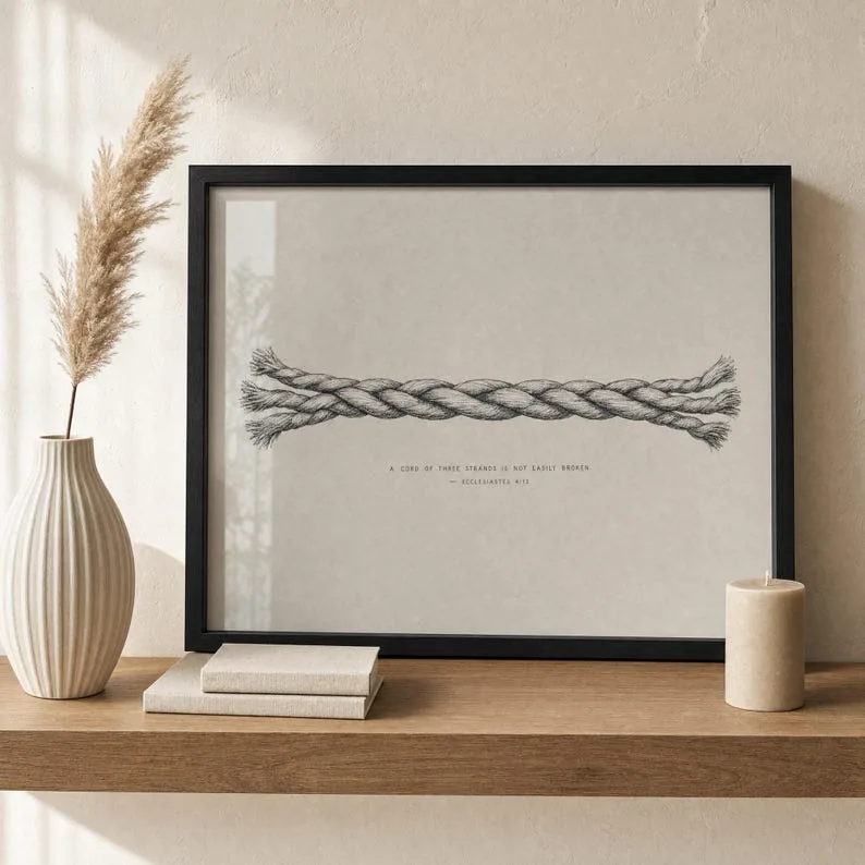
Cord of Three Strands Print, Ecclesiastes 4:12 Christian Wedding Wall Art, Pen and Ink Scripture Printable, Newlywed Unity Gift

Ruth 1:16 Print, Where You Go I Will Go, Christian Wedding Scripture Wall Art, Anniversary Gift Print

Custom Scripture Print, Your Favorite Bible Verse, Christian Wedding Anniversary Gift, Personalized Watercolor Wall Art
